Will wool paintouts level up my use of color?

My wool stash contains a lot of colors. You’d think I’d have no trouble pulling the exact color I need. So why do I never seem to have the color I’m looking for? Did I buy the wrong colors? Do I need to buy more? Is there a better way to approach using color in needle felting? I think there is. I’m going to make wool paintouts.
How I use wool colors today
I tend to use between 3 to 12 “straight out of the box” colors of wool for a project (e.g., for a red area, I’d use “Passion” by DHG). I sometimes do a little blending to shift a color. Considering this now, it seems odd. But I think it was just the way I learned to work with wool.
I learned to needle felt by doing a lot of tutorials. They tend to follow a paint by number approach – put color A here and color B there. And they use a lot of colors. I have purchased tutorials with supply lists that include 26 or 31 colors of wool. Keep in mind that this is for one project!
Needle felters don’t typically learn how to mix wool in the way a painter mixes their paint. But what if we could? That’s when I remembered paintouts.
What is a paintout?
Paintouts are an assignment I received when I took a painting class in college from Linda Ames-Bell. Linda led the Painting Department at the University of Toledo’s art school at the Toledo Museum of Art. On the first day of class, Linda gave us a list of paint colors to buy. We were then tasked with completing a paintout for each color (except black and white).
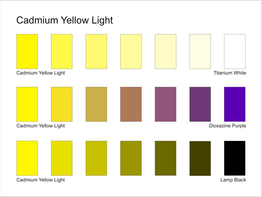
A paintout is an unstretched piece of gessoed canvas with three rows of seven rectangles. You mix paint to fill in each rectangle. Imagine you are working on a paintout for Cadmium Yellow Light. The first row would start with yellow right out of the tube and end with Titanium White. The second row would start with yellow and end with a complementary color (purple for yellow). The bottom row would start with yellow and end with Ivory Black. Here’s an example I mocked up in Affinity Designer of what that would look like.
I won’t lie. I loathed making paintouts. They took so much time to complete. But I bit the bullet and made one for every tube of paint in my toolbox.
Linda told us we should not bring a tube of paint into her classroom that we had not done a paintout for. Why? Because the paintout gave us an understanding of what the color could do, how it mixes with other colors, when to consider using it, and why. Making paintouts developed our skills and when they were done, they became a tool we used almost every day in that class.
Why do wool paintouts?
Like painters with paint, needle felters have thousands of colors of wool to choose from. If that’s not difficult enough, the colors are often not consistent. I purchase a color I love. When it runs out, I buy more. But it often doesn’t match the original wool I purchased. There are a lot of reasons why wool colors are inconsistent. I’m not blaming anyone. I just want to figure out how to make what’s available work.
Starting with two yellows
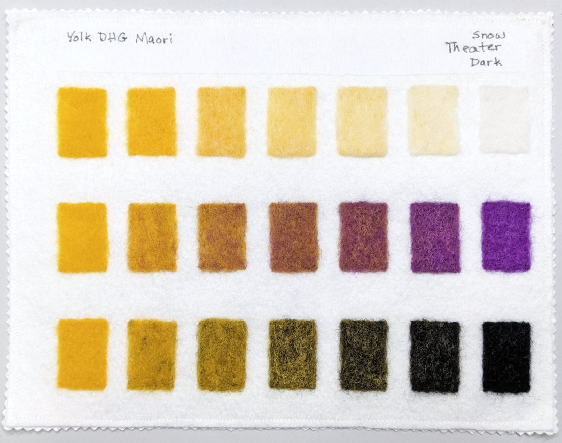
I’m going to use DHG’s Maori line of wool for this project. I’ll use a cool and a warm version of each color for these initial wool paintouts. To kick things off, I chose Sun as my cool yellow and Yolk as my warm. Here’s the wool paintout for Sun.

I started by placing the color I’m working with in each of the rectangles on the far left. I could be wrong, but I think this is a deviation from the Linda Ames-Bell paintouts. I believe we used the tint in the fourth rectangle of the top row as our base color for the middle and bottom rows. That base was used to create the stepped gradients for the complement and black. If anyone who took Linda Ames-Bell’s painting course remembers, please let me know!
Next, I added the colors on the far right. I’m using DHG Snow as my white, a DHG complement (Violet for Sun and Theater for Yolk), and DHG Dark for the black.
Then I worked on each row. I mixed the gradient steps for yellow to white, then yellow to purple, and finally yellow to black. I needed to work in a well lit area to check the color progressions.
Wool does not behave like paint
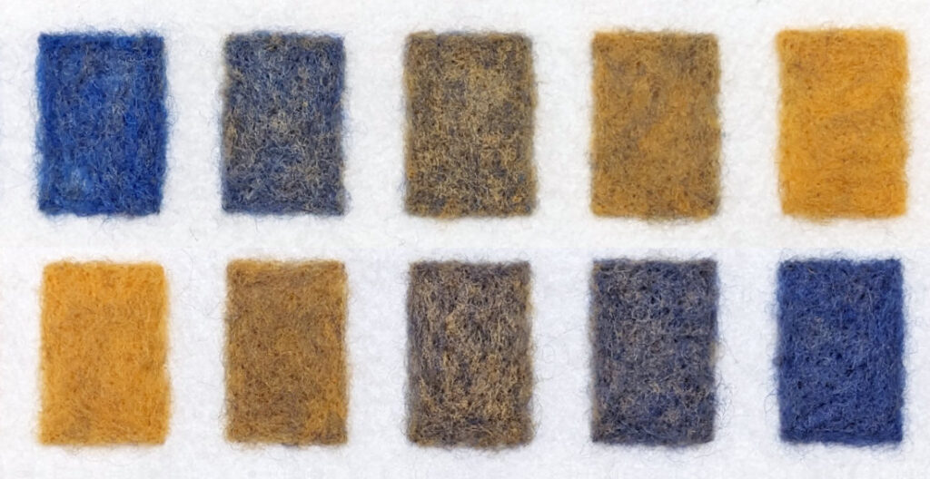
Dyed wool is fairly uniform in color since the individual fibers absorb the same dye. Given that wool is from an animal, there may be variations. But to the eye, it mostly appears to be a single color.
Since I’m manually mixing wool versus dyeing it, I could see individual strands of fiber from both dyed colors in my swatches. The prominence of those strands makes the colors heathered. It’s especially noticeable when combining a very light color with a dark one.
Mixing it thoroughly helps, but it is still heathered. It’s not a bad thing, just something I had not expected before trying this. Since Maori is a shorter fiber than a combed top, that also helps it blend. But if I am mixing a combed top to use as long fur, the heathered fibers would give the color more depth and richness. I think it would be preferable to using a solid dyed wool color.
Animal fur, skin, feathers, eyes, etc. are rarely one solid color. Maybe working with the heathered mixes will lead to some interesting results? I’ll have to experiment with it.
This idea has been interesting
I’ll explore a cool red and a warm red next. And I’ll write more about the results I’m hoping for. Stay tuned!
The photos used at the top of this post are from the following photographers:
- The photo of assorted colors of wool roving is by Sophiaxue123, CC BY-SA 4.0, via Wikimedia Commons. It is cropped.
- The photo of tubes of oil paint is by Jacqueline Brandwayn on Unsplash. It is also cropped.
