Starting this wool paintouts project took thinking, planning, and lately, trial and error. Since this is a long-term color mixing exercise, I would like a process to follow that works but doesn’t take all the fun out of learning!
If you haven’t read my previous paintout posts (the yellows, the reds), here’s a quick refresher on how I create a wool paintout.
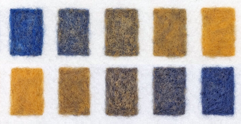
I start by cutting a rectangle out of a piece of white felt sheet. I needle felt three rows of seven rectangles on it. I use four “out of the box” wool colors (main color, white, black and a complementary color) to fill in the first and last rectangle in each row. Then I mix custom colors to complete the rest of the wool paintout. To see an example, scroll down and check out my paintouts for the two blues I chose to use as primaries.
Why not just mix and felt a gradient?
While I believe laying down and felting one long row of a gradient would be easier, mixing the individual steps in a gradient feels like it will help me achieve my goal of learning how to mix accurate wool colors. I think there is value in learning how to not just blend the color, but also how to see the steps. It trains your eye to really see the colors, to compare them, to notice balance, and unbalanced steps. I hope it will build muscle memory the way it did with the paint colors when I was in college.
One thing I have changed when working on a row
I originally started by mixing a step of color and felting it down. I would continue this until I finished a row. Sometimes this worked but it often didn’t. I’d have to pull the wool out and adjust the colors. This was happening mostly toward the middle and ends of the rows.
For the midpoint, I mixed a 50/50 blend of the colors (e.g., blue and white, blue and orange, or blue and black). Logically that seems like it should work. But colors, even wool colors, just don’t behave the way you might expect. When analyzing the stepped gradients, the 50/50 blend was often not the midpoint. It tended to be one or even two steps removed from that midpoint.
I changed my approach and decided to mix all the colors for a row before felting them down. That gives me the flexibility to adjust them. Like paint, some colors are stronger and shift the color quickly. I still start with the 50/50 mix and see how that reads. I mix more of it than I’ll need as I’ll use it on both directions of the stepped gradient. Then I split that mix up and start adding more of the pure color or white/complement/black to complete each row.
Here are the blues!
We reviewed what I’ve learned about the overall process so lets take a look at the latest colors. The blues I chose from DHG’s Maori line of wool for these two paintouts are: Chagall, my warm blue, and Evening, my cool blue. Chagall is a lovely clear, bright blue. Evening is more subdued but still a beautiful color.
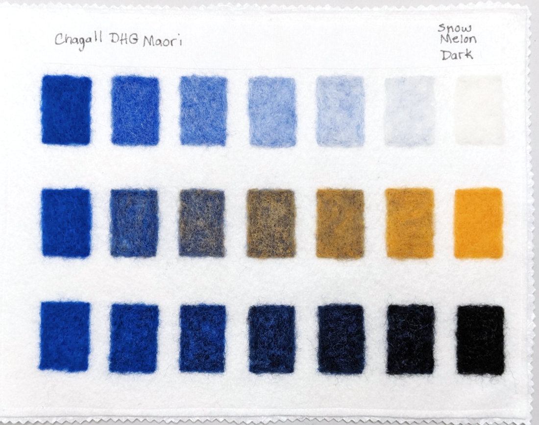
Since these are blues, it is hard not to think of them mixed with white as sky tints. Chagall seemed stronger and less diluted when mixed with white than Evening. The experience of blending them with black yielded a similar result.
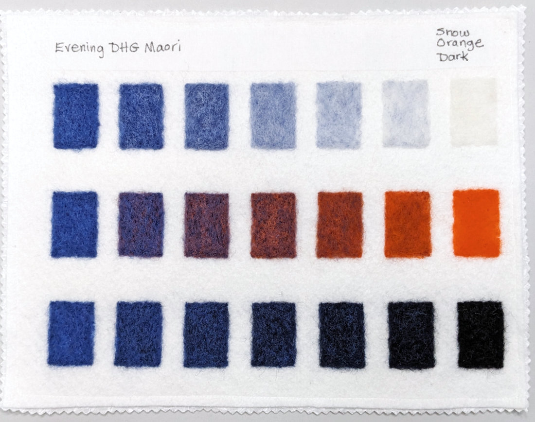
The strength of the colors was especially evident when mixing them with an orange complement. Chagall mixed with Melon produced some lovely neutrals that leaned toward grays. But Evening mixed with Orange resulted in colors that appeared more purple or reddish brown. Very interesting to observe.
It is time to change temperature
For this first round of primary color paintouts (yellow, red, and blue), I’ve been using complements of the same color temperature. For instance, if my yellow was warm, my purple complement would also be warm.
Next, I will start working on paintouts for the secondary colors (purple, green and orange). Since I’ve already used all of those as complements for the primaries, I’ll choose the opposite color temperature. My warm purple will be mixed with a cool yellow. I can’t wait to see how that will impact the hues!