Since I completed the primary color wool paintouts (yellows, reds, and blues), I am starting the complementary colors (oranges, greens, and purples). The oranges I have are DHG Maori wool in the colors Melon and Orange. I was a little worried that Melon was not a great choice as it feels very close to Yolk from the yellows. Turns out I was right to be concerned.
I also learned that Orange might be too close to the Chinese Lacquer red in my current wool palette. I was hoping Orange would have more of a bluish feel.
If you are new to my paintout project, I am questioning why needle felters end up purchasing so many colors for a project. I am attempting to come up with a set of colors I can use the way a painter uses tubes of paint. I chose a suite of colors following the color wheel (primary, complementary, etc.) and added a few extras I feel I may need. I tried to find a warm and cool option for each of the colors (e.g. a warm yellow and a cool yellow). I’m doing wool paintouts for each of these colors to learn how they perform. Let’s dig in.
Here are the oranges!
Melon was my choice for a warm orange. Since I used Melon as the complement for Chagall Blue (my warm blue) on the Chagall paintout, Evening was the blue complement this time.
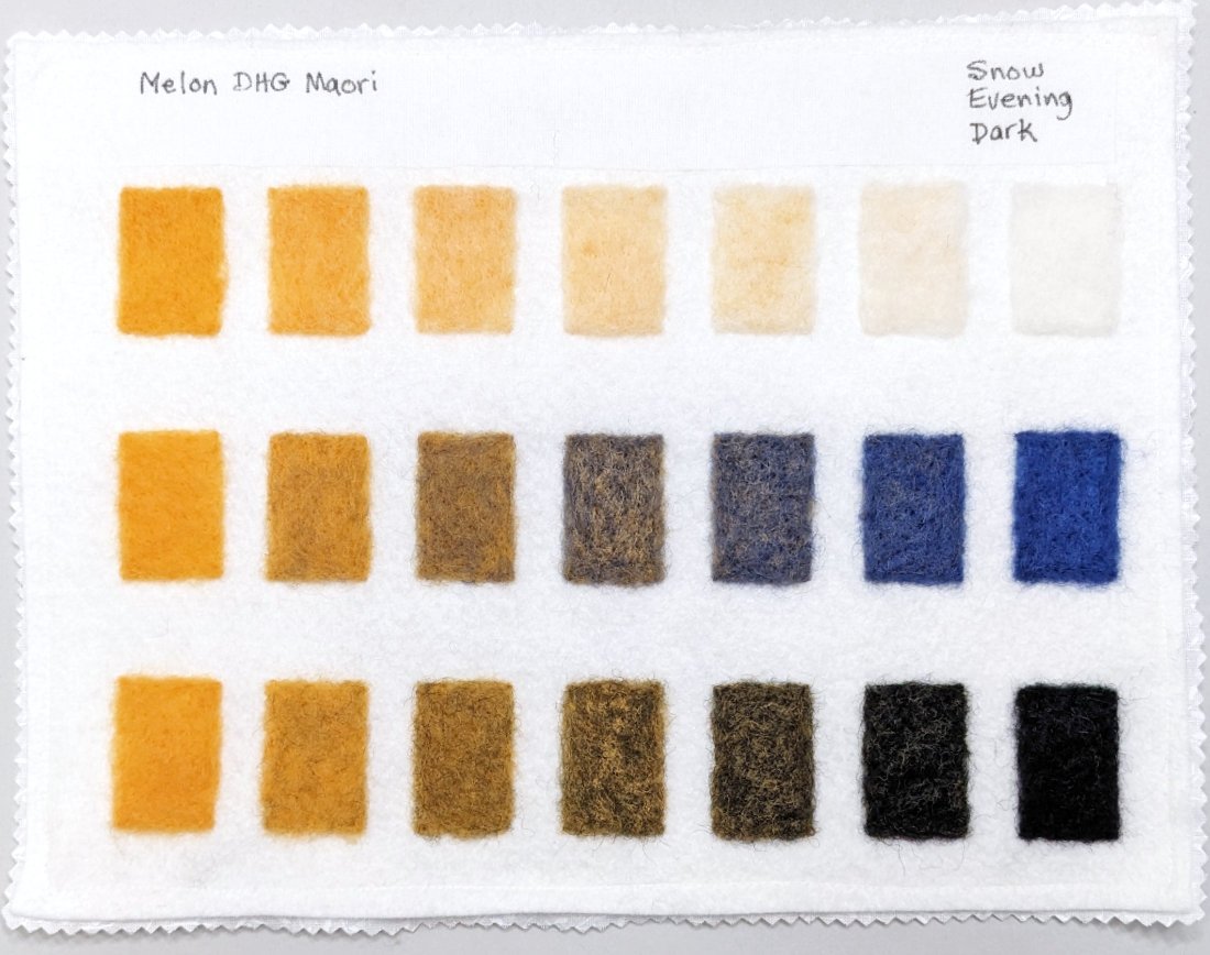
I would have preferred a more saturated warm orange but this is the only one I could find in stock when I purchased the wool for this project. It is a beautiful color but as mentioned earlier, it feels very close to the color Yolk.
Orange was cooler than Melon but it also feels warmer than I had hoped. It is hard to choose colors online so I’m not complaining. This has been a great learning experience and that’s what this project is about.
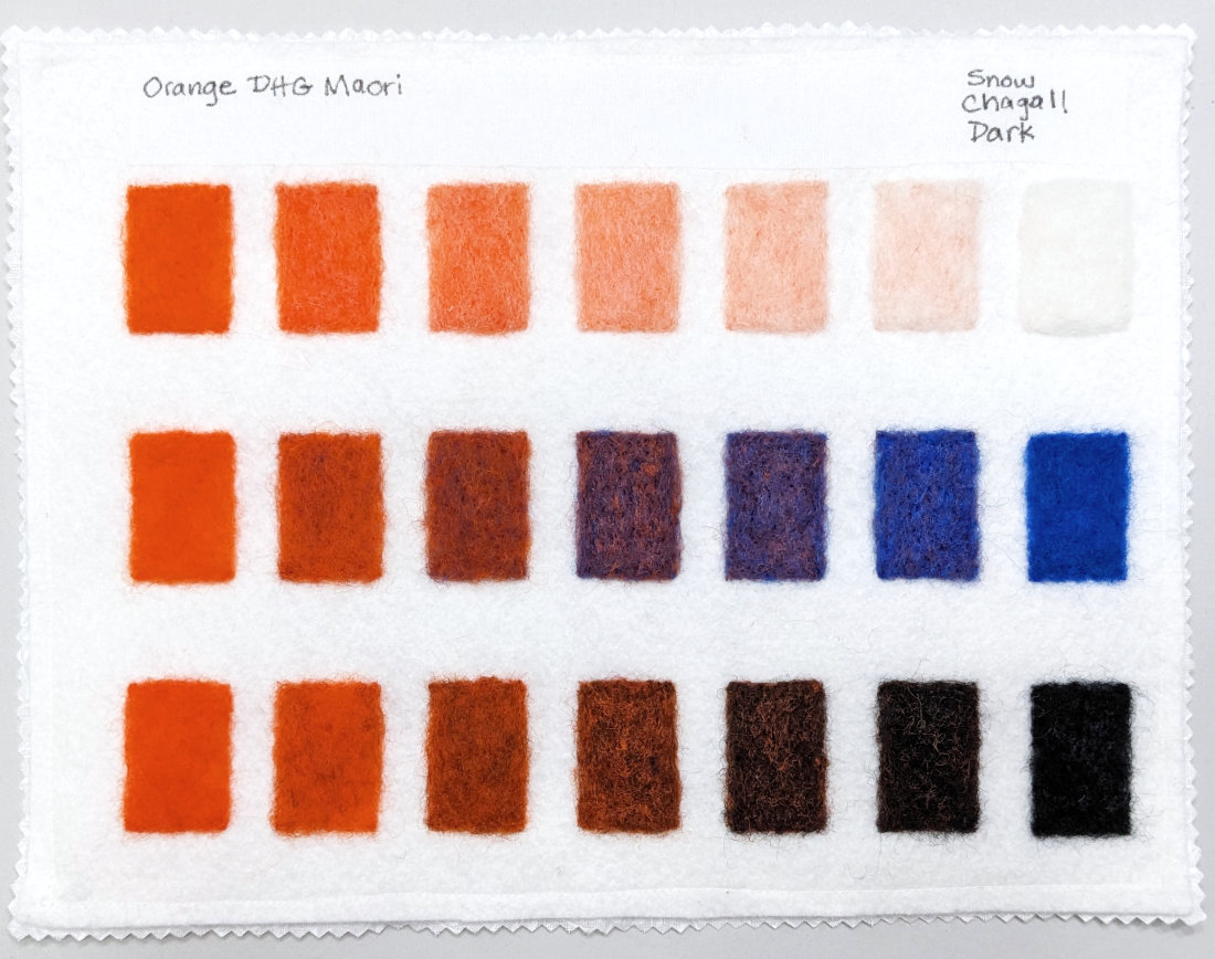
Since I used Evening as the complement for Melon, I used Chagall blue for Orange.
I should also mention that my phone camera is having an extremely hard time capturing these paintouts as accurately as I would like. I’m exploring some options and trying different lighting, etc. but for now, this is where I am.
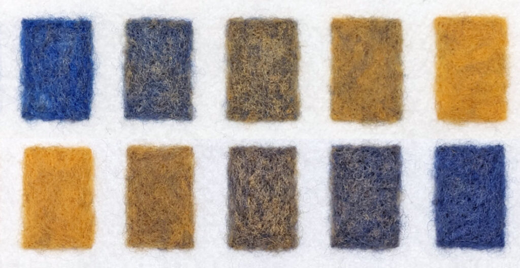
Mixing warm and cool wools didn’t make much of an impact
Evening and Chagall are noticeably different blues. But when mixed with the oranges, there wasn’t a dramatic color shift when mixing Evening versus mixing Chagall with the same orange. Here’s a chart I made to help demonstrate this.
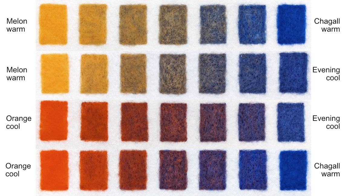
I flipped the rows from the blue paintouts and pasted them next to the orange rows. This makes it easier to compare the progression of change in the blended steps of color. It is easier to see the differences in real life. But it is still subtle. In the end, I’ll need to decide how often I need these gentle shifts in my work.
Should I drop one or both oranges from my wool palette?
Probably. I do not think I will keep both Yolk and Melon in my palette. I like the Orange but if I keep Chinese Lacquer, I probably don’t need that either. It feels like I can mix something close to Melon and Orange using primaries. I may also look for a different DHG orange.
I am going to wait before making these decisions. Once I complete the full round of wool paintouts, I will re-evaluate. It is encouraging that I am already finding that I don’t need as many colors as I thought to create a limited palette. But it is early days so stay tuned!